HAPPY HOUR REVISITED
Date 2020
Client Virgin Australia
Role Senior Designer
Type Graphic + Social
The Project
Key stakeholders:
Client: Virgin Australia Marketing and Brand team, responsible for the airline's promotional strategy and a key in revenue driving sales period.
Agency: CHE Proximity, led by Head of Design, Darren Cole, alongside our account team.
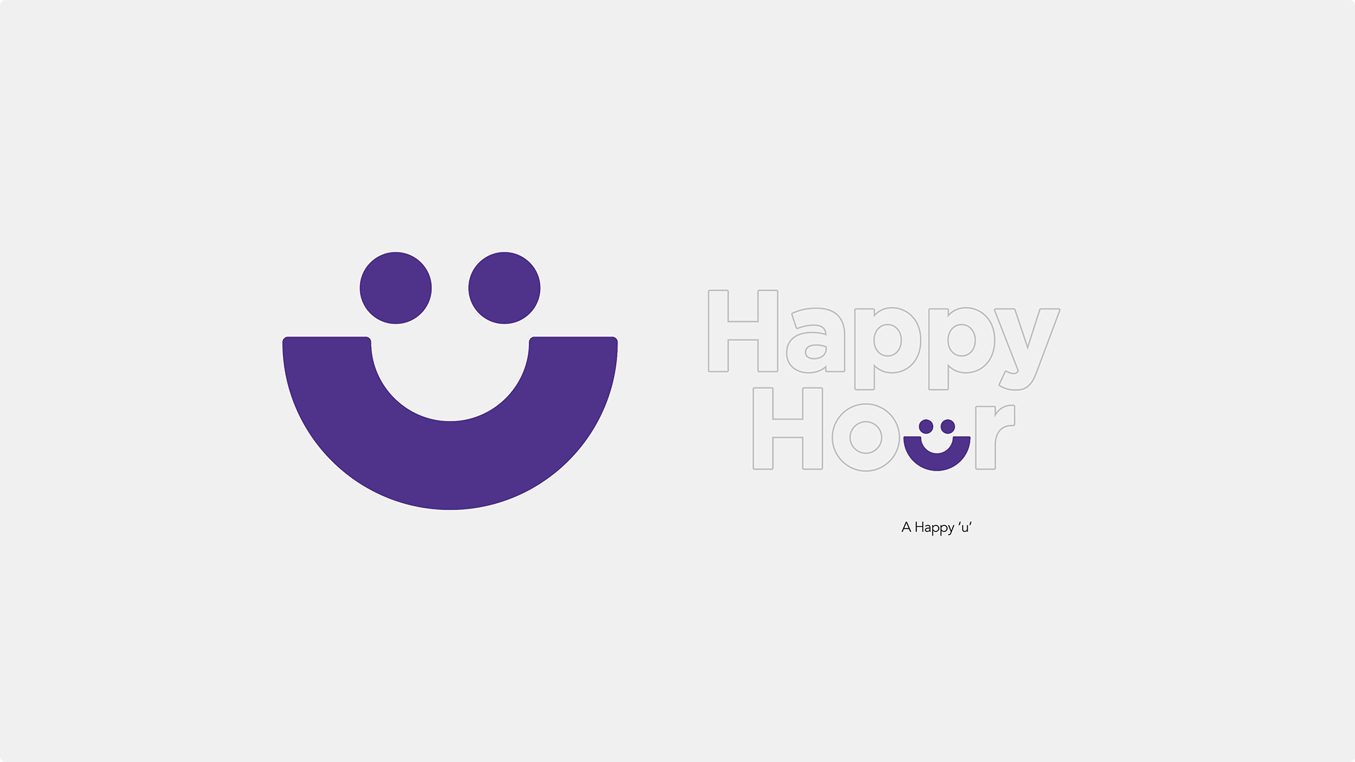
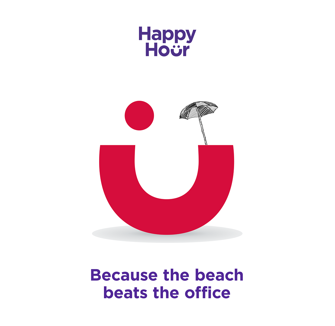
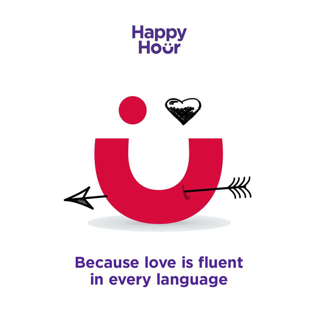
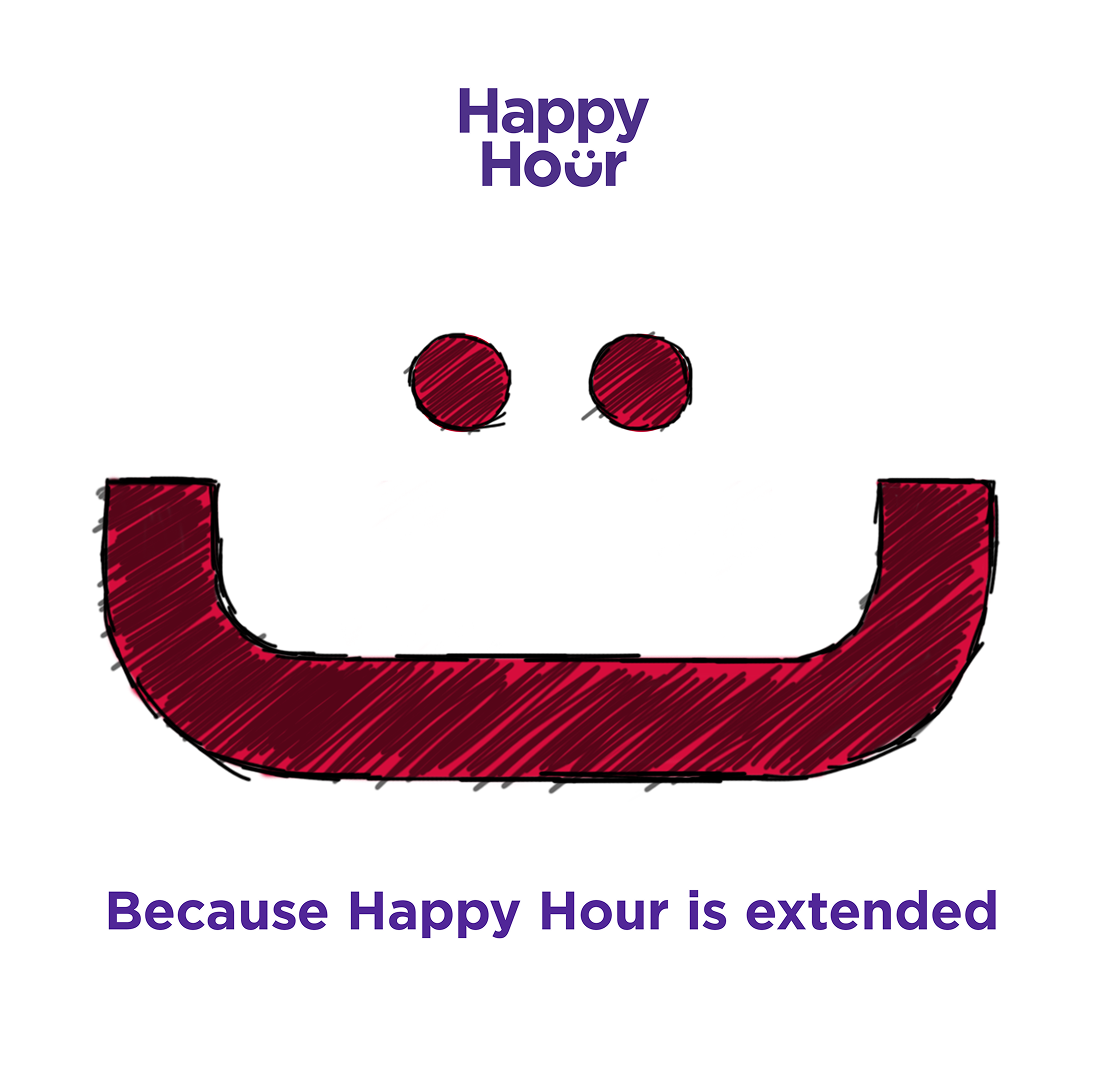
The brief was to reinvigorate the Virgin Australia’s ‘Happy Hour’ sale. The client wanted to elevate its perception of ‘cheap’ and reposition it as a savvy, sophisticated, and smart way to buy airfares. Capture the joy that comes from finding a great deal for a value conscious traveller. The final lockup aligned with this brief, using the ‘U’ in ‘Hour’ into a subtle smile, helped capture the ‘spark of joy’ and positive feeling of securing a great price.
The simplicity and cleverness felt sophisticated, not loud or cheap.
It was designed as a responsive, flexible device that could adapt to various promotions.
My Role in the Project
As the lead designer for this project, I was responsible for developing the core visual concept that would solve the strategic challenge. This involved translating the marketing goals of ‘savvy’ and ‘joy’ into a tangible design. I developed and refined the smiling 'U’ concept, ensuring it was graphically strong, simple, and ownable for the brand.
Concepts were presented to the Creative Directors and Head of Design. at CHE Proximity. This involved articulating the ‘why’ behind the design and explaining how this simple, flexible lockup met all brief’s strategic goals. I managed the feedback and iteration process, ensuring the final design was approved and fit for purpose. Following approval, I managed the delivery of the final assets, ensuring the client's internal team had all the necessary variations and guidelines to roll out the new lockup across different themes and digital platforms.
Project Success and Learnings
The project was a success as it was enthusiastically adopted by Virgin Australia. It provided them with a strong, ownable, and highly flexible lockup for their key sales promotions. The simplicity made it easy to deploy and its emotional resonance gave the sale a distinct personality that it previously lacked.
I learned that simple ideas are the strongest, reinforcing the power of a simplicity. The smile is a universal symbol of joy that encapsulates the entire brief. This project highlighted the critical value of designing a responsive brand device rather than just a static logo.
Looking back, I would have pushed to develop motion based examples. While it was designed to be flexible, I would have loved to present a more robust motion-graphics package alongside the initial concept to demonstrate its full potential in a dynamic, digital environment.